Your website is often the first interaction potential customers have with your brand. With the rapid growth of mobile usage and an increasingly diverse range of devices, ensuring that your website looks and performs optimally across all platforms is essential. This is where responsive web design comes into play. At Omega Studio India, we believe that a well-executed responsive design is a game-changer—it not only elevates user experience but also drives sales, boosts engagement, and builds lasting customer relationships. In this guide, we’ll explore why responsive web design is crucial for your business success and how it can transform your digital presence.
1. What is Responsive Web Design?
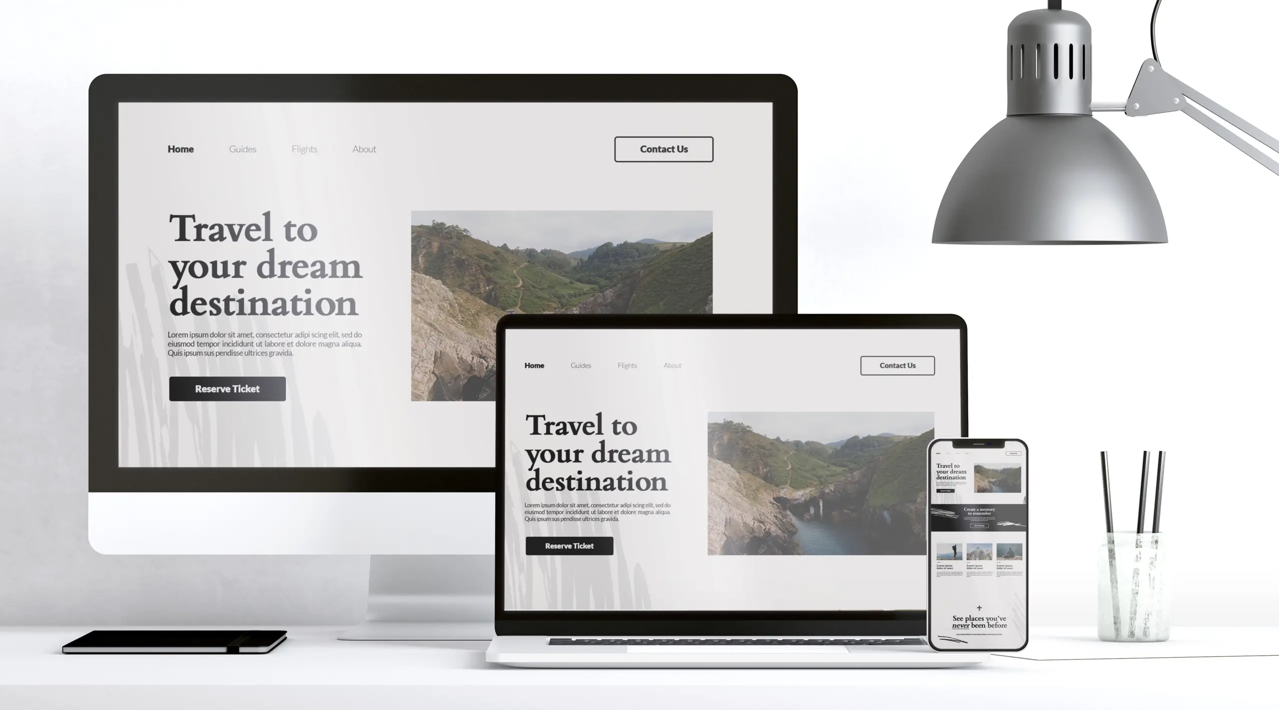
Responsive web design is an approach to building websites that automatically adjusts the layout, content, and functionality to fit the screen size and resolution of the device being used. Whether your visitors access your website via a desktop, laptop, tablet, or smartphone, a responsive design ensures that your content remains accessible, visually appealing, and easy to navigate.
Key Characteristics:
- Fluid Grids: Layouts that use relative sizing rather than fixed pixel dimensions allow your content to scale gracefully.
- Flexible Images: Images and media adjust to fit within the layout without losing quality or causing layout issues.
- Media Queries: CSS techniques that apply different styling based on the device’s screen size, orientation, and resolution.
By embracing these principles, responsive design guarantees that users receive a consistent and high-quality experience, regardless of how they access your website.
2. Enhancing User Experience
User experience (UX) is a critical factor in determining whether visitors convert into customers. A responsive website significantly enhances UX in several ways:
A. Seamless Navigation
When a website adapts to various screen sizes, navigation becomes intuitive. Users can easily access menus, buttons, and links, no matter what device they use. This ease of navigation leads to lower bounce rates and increased engagement.
- Example: A user on a smartphone can quickly find the “Buy Now” or “Contact Us” button without having to zoom in or scroll horizontally. This convenience keeps visitors on your site longer and guides them smoothly through the conversion funnel.
B. Faster Loading Times
Responsive designs often incorporate performance optimizations such as streamlined code, optimized images, and adaptive content. Faster loading times are not only essential for UX but also positively impact search engine rankings.
- Impact: A fast-loading website reduces user frustration and improves the likelihood of visitors staying on your site, ultimately increasing the chances of conversion.
C. Accessibility and Inclusivity
A responsive website ensures that everyone, including users with disabilities, can access your content. Accessibility features such as scalable text, adjustable layouts, and screen-reader compatibility are essential components of a user-centric design.
- Result: By making your website accessible to a broader audience, you create a more inclusive digital environment, which can lead to higher user satisfaction and loyalty.
3. Boosting Sales and Conversions
Responsive web design has a direct impact on your bottom line. Here’s how it helps drive sales and conversions:
A. Increased Mobile Traffic
With mobile devices accounting for a significant portion of internet traffic, a responsive design ensures that you do not miss out on potential customers. Studies show that users are more likely to convert on websites that are optimized for mobile devices.
- Statistic: Research indicates that a majority of consumers now shop on mobile devices. A responsive design caters to this trend, providing a seamless shopping experience that encourages transactions.
B. Improved Conversion Rates
A well-designed responsive website reduces friction in the conversion process. When users can easily navigate, find information, and complete transactions without technical glitches, they are more likely to make a purchase.
- Case in Point: E-commerce websites that employ responsive design often see higher conversion rates because the checkout process is smooth and the call-to-action buttons are prominently displayed across all devices.
C. Lower Cart Abandonment
Inconsistent user experiences on different devices can lead to frustration and, ultimately, cart abandonment. Responsive design minimizes these issues by ensuring that the shopping experience is uniform and hassle-free.
- Outcome: By reducing cart abandonment, businesses can see a direct increase in sales and overall revenue.
D. Enhanced Credibility and Trust
A website that adapts flawlessly to all devices signals professionalism and reliability. Users are more likely to trust a brand that offers a polished and consistent online experience. Trust is a crucial factor in converting visitors into loyal customers.
- Trust Factor: When visitors see that your website is modern, responsive, and user-friendly, they feel more confident in engaging with your brand, whether it’s making a purchase, signing up for a newsletter, or reaching out for more information.
4. SEO Benefits of Responsive Web Design
Search engine optimization (SEO) is closely linked to user experience. Search engines, particularly Google, prioritize websites that offer a seamless experience across devices. Here’s how responsive design can improve your SEO performance:
A. Single URL for All Devices
Responsive design uses a single URL for all device types, making it easier for search engines to index and rank your content. This consolidation avoids duplicate content issues and ensures that all your SEO efforts are focused on one domain.
B. Enhanced Mobile-First Indexing
Google’s mobile-first indexing means that the search engine predominantly uses the mobile version of your website for ranking and indexing. A responsive design is inherently mobile-friendly, thereby boosting your SEO rankings.
C. Improved User Engagement Metrics
Metrics such as bounce rate, time on site, and pages per session are important ranking factors. A responsive website that provides a consistent experience across devices is likely to see improved user engagement, positively influencing these metrics and your overall SEO performance.
D. Faster Page Load Times
As mentioned earlier, faster loading times are crucial for both user experience and SEO. Responsive designs that optimize load speeds help improve your search engine rankings, leading to higher visibility and increased organic traffic.
5. Future-Proofing Your Website
Technology and user behaviors continue to evolve. Investing in responsive web design is a strategic move that future-proofs your website against emerging trends and devices.
A. Adaptability to New Devices
The digital landscape is constantly changing, with new devices and screen sizes emerging regularly. A responsive design ensures that your website remains functional and aesthetically pleasing on any future device, saving you the need for frequent redesigns.
B. Cost-Effective Solution
Instead of maintaining separate websites for mobile and desktop users, a responsive design consolidates efforts into a single platform. This approach not only reduces development and maintenance costs but also ensures consistency across all user touchpoints.
C. Continuous Relevance
A responsive website keeps your brand relevant in an ever-changing digital world. By providing an optimal experience for all users, you position your business as forward-thinking and customer-centric—a quality that is increasingly valued by modern consumers.
6. Implementing Responsive Web Design: Best Practices
For businesses looking to implement or improve responsive web design, here are some best practices:
A. Start with a Mobile-First Approach
Designing for mobile first ensures that the core functionality and content are prioritized. Once the mobile experience is perfected, expand the design to accommodate larger screens.
B. Use Flexible Grid Layouts
Adopt fluid grid layouts that use relative sizing (percentages) rather than fixed measurements. This allows the layout to adjust seamlessly to different screen sizes.
C. Optimize Images and Media
Ensure that images are flexible and load quickly on all devices. Utilize techniques like image compression, responsive image attributes, and modern formats (e.g., WebP) to enhance performance.
D. Test Across Multiple Devices
Regularly test your website on various devices and browsers to ensure consistency in design and functionality. Utilize tools like BrowserStack or responsive design testing platforms to simulate different environments.
E. Prioritize User Experience (UX)
Focus on clear navigation, readable fonts, and touch-friendly interfaces. Consider user feedback and analytics data to continuously refine the design and usability of your website.
F. Leverage Modern Frameworks
Modern front-end frameworks such as Bootstrap, Foundation, or Materialize can help accelerate the development of responsive websites. These frameworks offer pre-designed components and grid systems that simplify the process.
Conclusion
Responsive web design is no longer just an option—it’s a necessity for any business that wants to thrive in the digital age. By ensuring that your website looks and performs beautifully across all devices, you not only boost user experience but also drive higher conversion rates, enhance SEO performance, and future-proof your digital presence.
At Omega Studio India, we are committed to delivering cutting-edge, responsive web design solutions that empower businesses to achieve their full potential. Whether you’re looking to revamp an existing website or build a new one from scratch, our team of experts is here to help you create a seamless, engaging, and conversion-optimized online experience.
Ready to boost your sales and elevate your user experience?
Contact Omega Studio India today to learn how our responsive web design solutions can transform your business.
Visit www.omegastudio.in to get started on your journey to digital excellence.